Yatis
Yatis is an enterprise IoT solution provider

Building the Final Power BI Report
Step 1: Add a Date Filter
Open Power BI Report:
Open your Power BI report where you've already loaded the data.
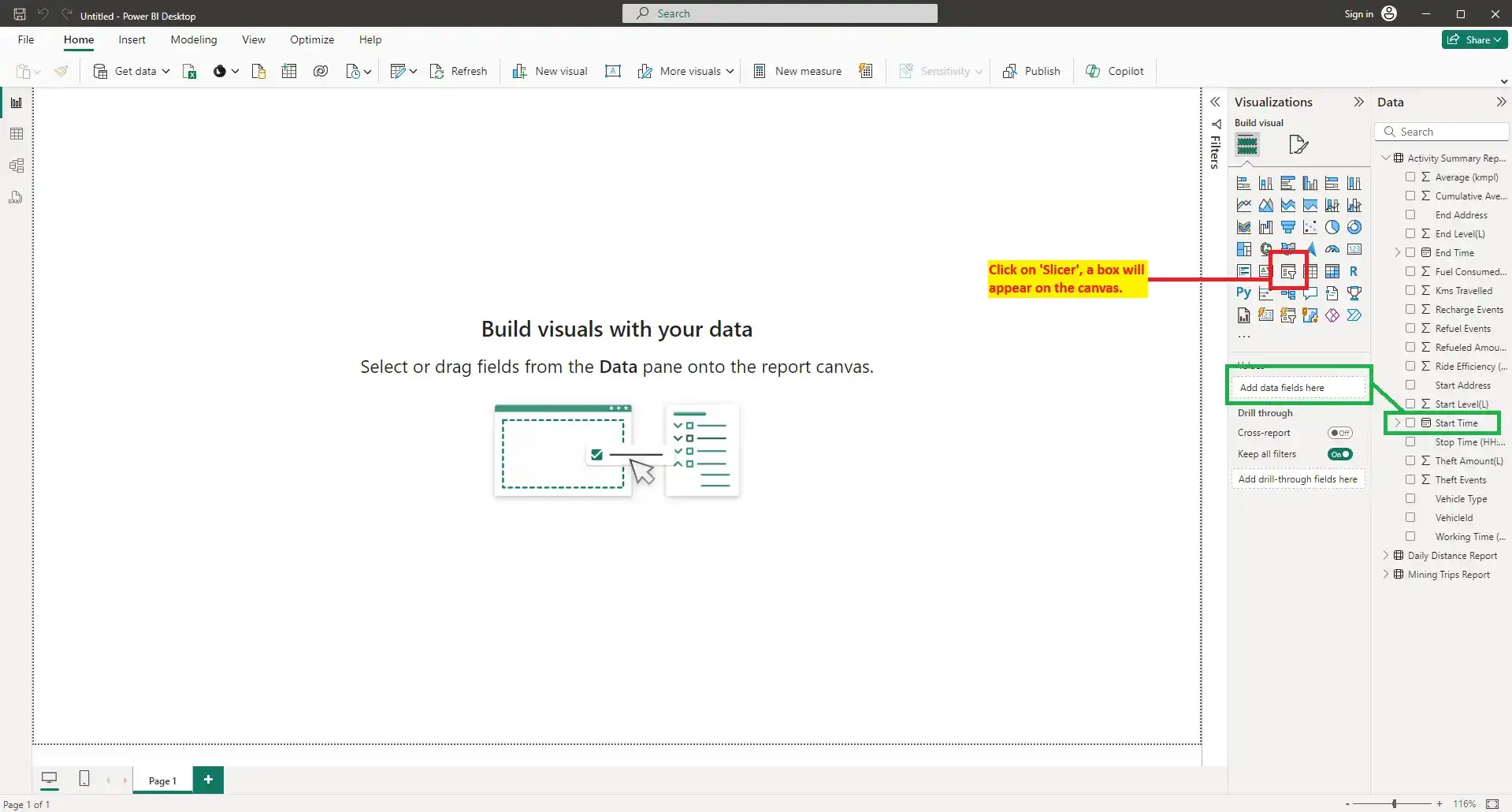
Create a Date Slicer:
- Go to the Report view.
- In the Visualizations pane, select the Slicer visual.
![]()
- Drag the Date field from the Fields pane to the Values section of the slicer.
- Adjust the slicer to show the date range you want to filter by, such as a calendar view or a range slider.
![]()
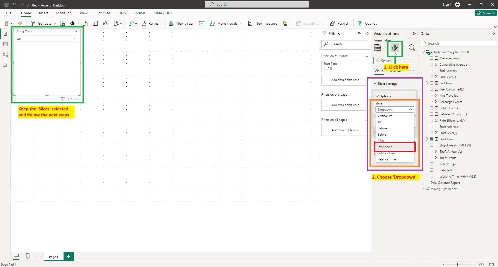
Configure the Slicer:
- Click on the slicer to activate the Format pane.
- Customize its appearance and interactions, such as enabling single select, changing orientation, or applying formatting.

Step 2: Add Charts
Create a Bar Chart:
- In the Visualizations pane, select the Stacked Bar Chart icon.
- Drag the VehicleID field to the Y-axis.
- Drag a relevant numerical field, like Working Time in Minute to the X-axis.
![]()
- Click on the chart to activate the Visualizations pane.
- Select the Filters section.
- Expand VehicleId to add the filter on the stacked bar graph.
- Set the filter type to Top N.
- Enter 5 as the number of items.
- Choose Working Time in Minute as the value by which to filter.
![]()
Create a Treemap as a Filter:
- Select the Treemap visual from the Visualizations pane.
![]()
- Drag the Vehicle Type field to the Category and Values field.
- Use the treemap to filter other visuals by clicking on the segments representing different vehicle types.
- Format the treemap using the Format pane to adjust the size, labels, and colors.
- Select the Treemap visual from the Visualizations pane.
Create a Donut Chart:
![]()
- Select the Donut Chart icon from the Visualizations pane.
- Drag the Vehicle Name field to the Legend.
- Drag the Distance Travelled field to the Values.
- Use the Format pane to customize the donut chart’s appearance, such as adjusting the size, colors, and data labels.
Create a Line and Stacked Column Chart:
![]()
- Select the Line and Stacked Column Chart icon from the Visualizations pane.
- Drag the Vehicle Type field to the X-axis.
- Drag the Fuel Consumed field to the Column Y-axis.
- Drag the Working Time in Minute field to the Line Y-axis.
- By default, Power BI sums these values. To change this to an average:
- Click on the dropdown arrow next to the field name in the Values section.
- Select Average from the list of available options.
- Format the chart using the Format pane to customize colors, lines, and column appearances to match your report's theme.
![]()
Create a Line Chart:
![]()
- Select the Line Chart icon from the Visualizations pane.
- Drag the VehicleId field to the X-axis.
- Drag Duration in Minute and Moving Time in Minute fields to the Y-axis.
- Drag Idling Time in Minute and Parking Time in Minute fields to the Secondary Y-axis.
- Format the chart using the Format pane to adjust line styles, colors, and labels for better visualization and clarity.

.webp)
.webp)

.webp)
.webp)
.webp)
.webp)
.webp)
Step 3: Add a Text Box and Cards
Add a Text Box for the Report Name:
![]()
![]()
- Select the Text Box icon from the Insert menu.
- Type in the desired report name, such as "Vehicle Analysis Report," and format the text using the options in the Format pane.
- Position the text box at the top of the report to serve as the title.
Add Cards for Vehicle Counts:
![]()
- Select the Card visual from the Visualizations pane.
- Drag the VehicleId field to the Fields section of the card.
- Change the aggregation from First to Count(Distinct) to display the total number of unique vehicles.
- Disable the category label in the Format pane and add a custom label, such as "All Vehicles Count."
![]()
![]()
- Repeat these steps to create additional cards for the Excavator Count and Dumper Count by applying filters to the card visuals to count only those specific types.
![]()

.webp)
.webp)
.webp)
.webp)
.webp)

.webp)
Step 4: Add a Table
Create a Table Visual:
![]()
- Select the Table visual from the Visualizations pane.
- Drag the following fields to the table: Vehicle Type, Ride Efficiency, Fuel Consumed, and Kms Travelled.
- Use the Format pane to adjust the table's style, such as font size, color, and gridlines, to enhance readability.
.webp)
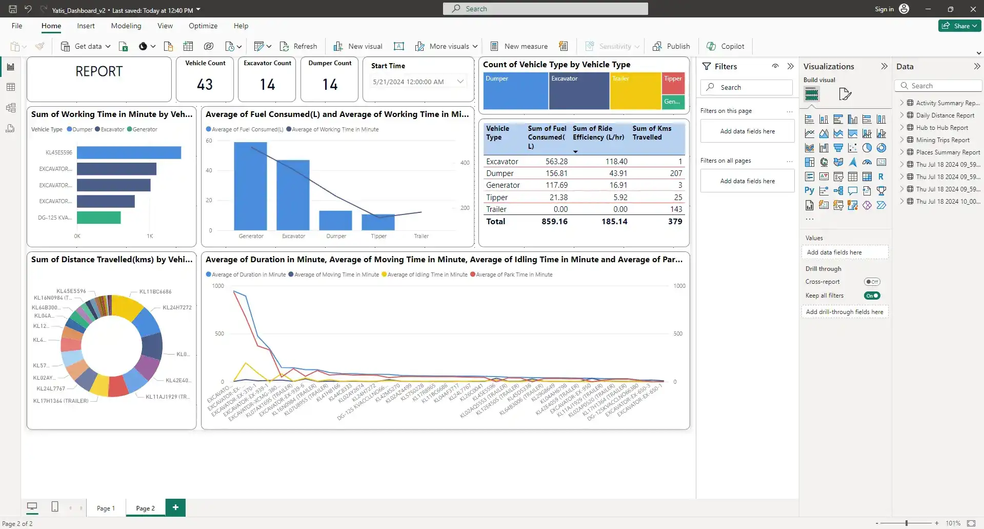
Step 5: Arrange and Finalize the Report
Rearrange Visuals on the Canvas:
Drag and drop all visuals to organize them logically on the canvas. Ensure each element is clearly visible and contributes to the overall story of the report.
Style the Report:
Use consistent color schemes and formatting options across all visuals to create a cohesive look. Adjust the size and position of visuals for a balanced layout.
Finalize and Review:
![]()
Review the entire report for accuracy and interactivity. Make sure all filters, slicers, and cards function as expected. Add any additional notes or descriptions necessary for clarity.

Conclusion
By adding a text box for the report name, cards for vehicle counts, and a detailed table, your Power BI report becomes a comprehensive and interactive tool for analyzing vehicle data.